
Whether it’s a cute character 1900s cottage, a not-so-cute 1980s villa or anything in-between, there are definitely a lot of you guys who are buying older homes and doing them up.
But when it comes to painting these houses, we don’t always want to re-paint them in the colours that were fashionable in the era the house was built. And why would you? I’m definitely not a fan of the gentle apricot and beige everything that was popular in the 90s. And I would find it hard to live with the heavy Brunswick greens and dark maroons that were popular in Victorian times. Or, as we uncovered personally while slowly taking apart the layers of our Crap Shack, that not-so-appetising guacamole-green-brown that was popular in the 1970s. Yuck.
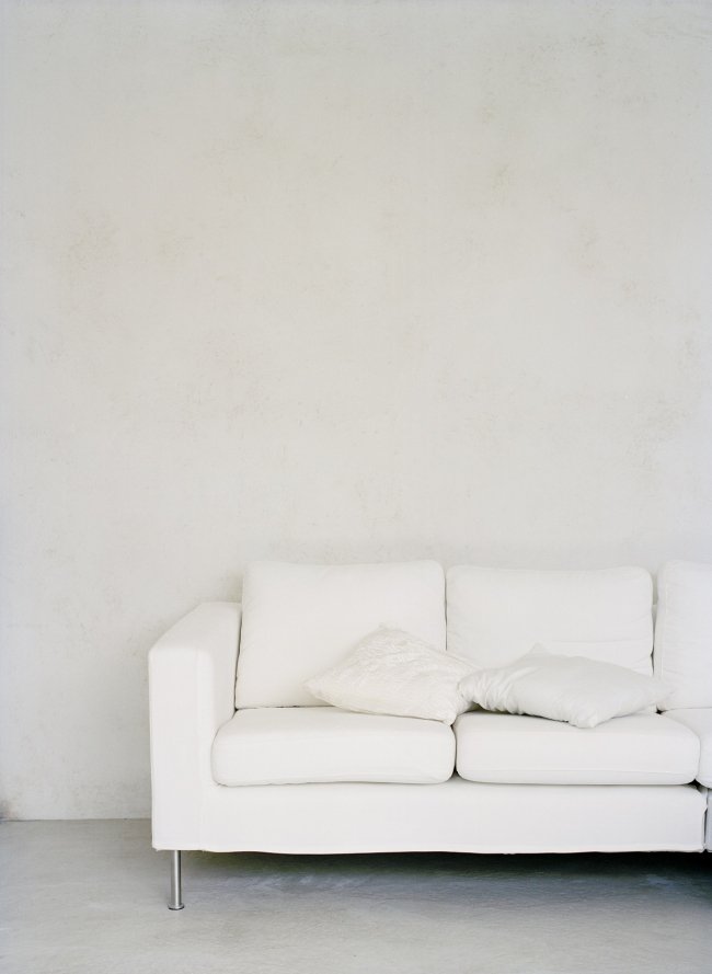
Warm light grey paint adds to the timeless appeal of this Palmyra cottage. Photo by Red Images Fine Photography.
So after a few House Nerds emailed me to ask if I could do a story with tips for choosing MODERN paint colours that suit older homes, I thought I would do exactly that. Today I chat to colour expert and Bauwerk Creative Director Bronwyn Riedel, who knows everything about choosing the right colours for your interiors, to get her tips.
AND we have a giveaway! You can win a Bauwerk prize pack including 4L of lime paint valued at $88, a natural fibre brush valued at $22 and a Bauwerk email colour consultation to get just the right colour for you. Enter at the end of this post.
HOW TO CHOOSE MODERN PAINT COLOURS FOR OLDER HOMES
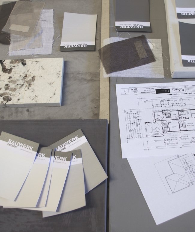
COLLECT IMAGES THAT YOU LOVE
If you are hoping to update or modernise your older home with paint but don’t know where to start, Bronwyn says one of the best (and easiest) first steps is to save photos of colours and ideas you like. “I always think it’s great to collect lots of ideas from magazines, blogs, Pinterest and anything that inspires you, including colours from nature, and put them all into a mood book or mood board,” she says. “Then try and see in your mind’s eye a feel or concept that works for your individual taste and lifestyle. Don’t try and do every style in one house. Be true to the style of your home - let your house speak to you also. Stick with a colour palette that works from one room to the next. The eye takes in colour subconsciously, so think about that when planning your colours.”
Pinterest is a fantastic tool for visually curating colours and images you love. Every time we start a new room or project in our house, I pin ideas and things that I like to get a rough feel for a space before we start.
GETTING WHITE RIGHT
White still leads the way when it comes to interiors. “Whitewash is our favorite trend at the moment,” says Bronwyn. “It works everywhere from interior to exterior from old to new.”
But with hundreds of shades on the market, a common dilemma for the modern home owner - myself included - is choosing the perfect white.
Bronwyn says the difficult thing with whites is the underlying colours that reflect once they are on the wall. “That little chip you saw at the hardware store just doesn’t look the same,” she says. For example, the colour of your flooring can change the look of the white once it’s on your wall.” Many old Australian character homes feature jarrah floorboards, the glossy reddish hue of which can ‘bounce’ onto your walls, making some whites look reddish-pink. Meanwhile, blackbutt flooring has golden undertones that will also bounce onto your walls.
LIGHT AND WHITE: White walls in this 1920s Watermans Bay rental home given a makeover by interior designer Nelly Reffet. Photo by Red Images Fine Photography.
ABOVE: White looks beautiful in this 1960s character home in Hilton, letting the polished jarrah floorboards and ceiling details be the stars. Photo Red Images Fine Photography.
This 1903 worker's cottage in West Leederville features white walls through the living area. Photo by Red Images Fine Photography.
To avoid this, choosing the right white is important. “Many conventional paints are tinted with artificial colours and they reflect very yellow or blue,” says Bronwyn. “Bauwerk Whitewash and all of our favorite top four whites - Whitewash, Eggshell, Chalk and Stone were created with this in mind. Because we use natural pigments you will not see the underlying reflection of any yellow or blue. They are also the only whites that can be patched without seeing that a patch has been done. Very easy to apply and give a very natural white from pure white to a touch of grey in the white.”
After a white for a classic character home? “Bauwerk Eggshell is a perfect white for classic heritage character homes, because it is just a little bit warm,” says Bronwyn.
As a general guide, cool whites are well-suited for open-plan living spaces and rooms with lots of natural light, and give a great timeless feel, while warmer whites are ideal for smaller rooms that don’t have a lot of natural light, such as bedrooms or studies, by giving them a cosy or warm feeling.
Jarrah floors? Bauwerk Whitewash will work beautifully, like in this example below of stylist Meghan Plowman’s 1940s character home (you can see her Bauwerk Whitewash transformation here).
Styling and photo by Meghan Plowman.
“Generally I would say warmer whites suit more traditional homes and cooler whites match in with modern homes,” says Elements at Home blogger and interior designer Kristie Castagna. “But - and this is the hard part - I think it’s also about the style the owner wants to achieve versus the amount of natural light.” For example if you have a Californian bungalow with lots of natural light, Kristie recommends keeping in the realm of a warm white.
For an older home without much natural light, she suggests going for a colour rather than a cool or warm white, which can run the risk of looking stark.
GOING GREY
Grey came into fashion a while ago but rather than fading away, it looks like it’s here to stay in all its shades, and for good reason. It’s a fantastic choice for adding a modern touch to an older home, says Bronwyn. “Grey works with everything and it’s the most versatile neutral,” she says. “It’s especially good internally in Australia because of how much natural light we have - it pulls back on the warmth of the brown-toned neutrals.”
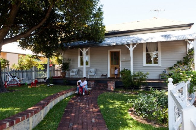
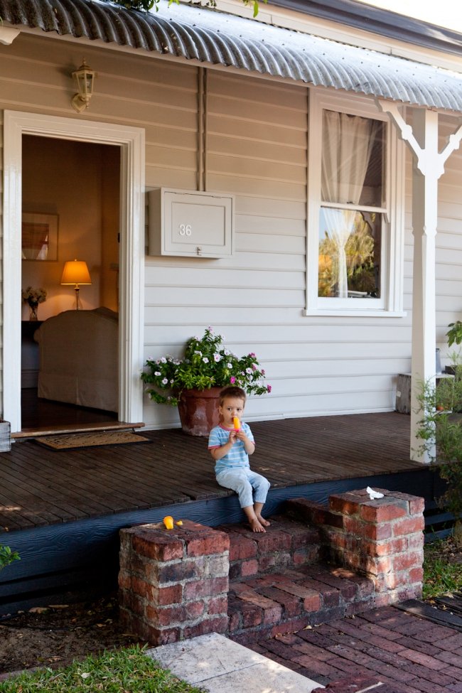
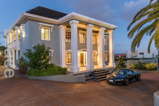
WARM GREY WEATHERBOARD: I LOVE grey for exteriors - particularly weatherboard cottages like this one. Owners Katie and Ben Stanwix painted their little Palmyra cottage in Dulux Australia Beige Royale, done at twice the strength because their exterior gets so much light. Photo by Red Images Fine Photography.
WORKER'S COTTAGE: This 1920s
Part of grey’s popularity is that it suits a huge variety of homes – and it looks really wonderful in older homes such as those from the 1910s, 20s, 30s and 40s; highlighting lovely high ceilings and period details like picture lines and fireplaces without detracting from them.
Grey is also a nice pick for homes built more recently, says Bronwyn. “Bauwerk Oyster is a beautiful warm grey that is perfect if you want to modernise a dated 70s home with a lovely neutral tone but not resort to white,” she says.
Looking to go darker grey? “Bauwerk Slate is a gorgeous rich grey perfect for creating a cosy feel in bedrooms or lounges,” says Bronwyn.
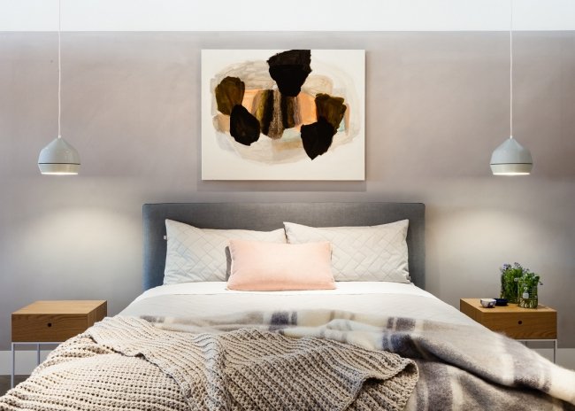
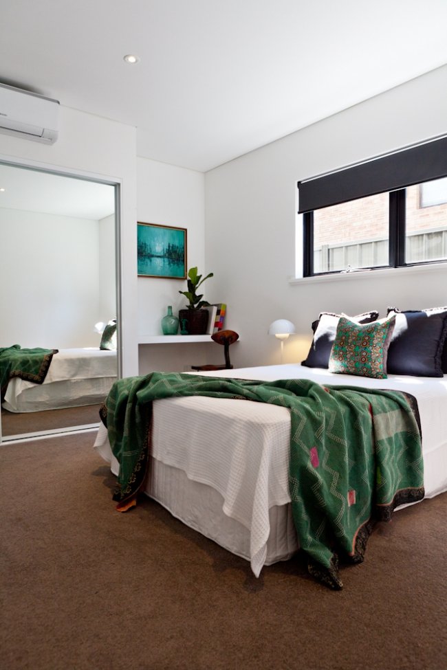
WARM GREY: Not an old house, but this bedroom set-up at the Jardan showroom demonstrates the warmth grey can add to a bedroom. Paint by Bauwerk, photo by James Geer.
DELVING INTO THE DARK AND DRAMATIC
A paint trend that I really love is that these days we are being really bold with the richest, darkest colours on our walls, like the gorgeous room below with Bauwerk Squid Ink walls. A while ago we painted our house’s entry black and I still really love it. Bronwyn is also a fan of dark inky shades. “Inky colours are so beautifully moody and look wonderful with any colour,” she says.
You might think you need abundant natural light to pull off a really dark paint in a big room, but the good news is that’s not true – a dark paint can look equally good in a small room with little light, making it cosy and giving it punch. A dark colour can blur a room’s boundaries so they appear to recede, which can actually make a small space appear bigger. Beautiful mirrors are a nice way of adding an expensive-looking touch to a dark wall plus they’ll bounce the light around and increase the illusion of space.
DARK AND DRAMATIC: This beautiful lime paint is Bauwerk Squid Ink.
CHARCOAL WALLS: This East Perth apartment is one of many in an apartment complex designed by Krantz & Sheldon in the 1960s. At just 36sqm in floor size, not many people would have been so bold to choose such a dark wall colour for such a small space, but architect Anthony Hines did. the deep colour actually gives the walls the illusion of receding, making the space seem larger – and more sophisticated. “The apartment was actually going to be light-coloured,” says Anthony, who painted the whole place white before deciding to go dark. “The dark colour scheme blurs the walls.” You can see the whole makeover here. Photo by Nutkin Images.
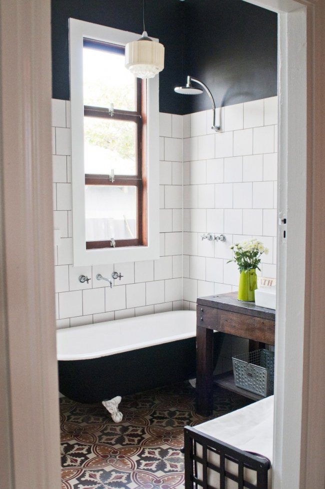
Black walls add impact to this beautiful bathroom in the home of Etica Studio owner and designer Carla Karsakis. Photo by Meghan Plowman.
USING PAINT TO TRANSFORM DATED INTERIOR FEATURES
I know there are many people who cry murder at the thought of painting wood. I, for one, am all for it if it’s not a prized vintage or heritage piece or feature. A big trend right now is to use paint as a way to refresh what you already have, rather than gutting the old and buying or starting anew. A lick of paint can transform an old, dark timber kitchen that you want to visually lighten up, modernise pine-panelled walls that have gone orange with age or transform a piece of furniture that could do with a bit of love. I love that we are thinking of painting old kitchen cupboards and bathroom vanities rather than turfing out the old. It’s frugal and it means less waste.
Bronwyn agrees. “That’s a trend we embrace,” she says. “It can be so much fun to see how you can completely change the way your house looks with a great find from a secondhand store or to repurpose something old from home. Also, painting is a great inexpensive and easy DIY way to completely transform your home. Bauwerk Aquamarine is lovely for painting timber cabinets that need an upgrade - and Bauwerk Pussywillow is one of my favourites and lovely for covering over that peachy-apricot colour that was so popular in houses built in the early 90s!”
Bronwyn says along with white, pastels are very popular at the moment especially mint, pale blue and dusky pink. These soft shades often work really well in character and mid-century homes.
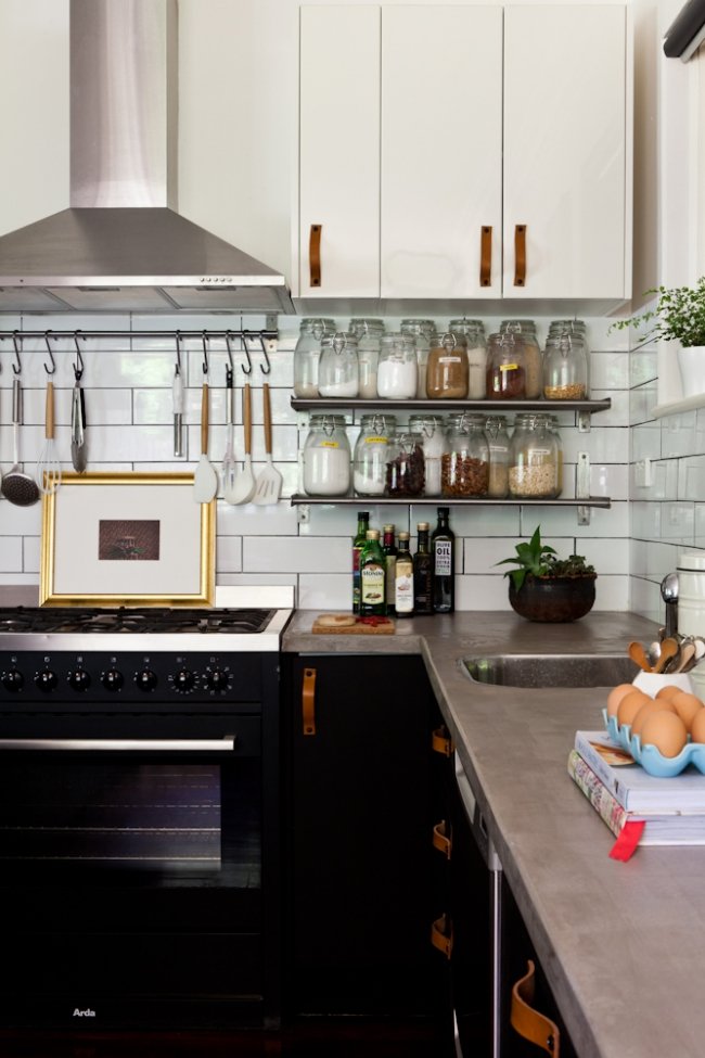
FROM BLAH TO BLACK: Interior designer Hayley Gemma painted her ordinary kitchen cabinets black and swapped the handles for leather pulls to give her country kitchen a contemporary update without breaking the bank. Photo by Red Images Fine Photography.
MODERN COLOURS FOR EXTERIORS
We’ve gone fairly neutral with interior colours on our older homes in the past decade – and it works beautifully with our landscape and bright Australian sun.
You guys probably already know how I feel about dark, dark exteriors, like the darkest blue-grey walls and black-painted weatherboard cottages – I love them. A lick of black paint can not only disguise some less-than-desirable features, but it can take many an older house from daggy to modern. One of Bauwerk’s newest, darkest colours is called Obisidian and it is a lovely pick for render or bricks, outside or inside.
Grey exteriors are still on-trend and we are seeing a LOT of grey exteriors in all shades. I love this look - as you can probably tell by the number of grey houses on House Nerd! It's modern yet timeless and tasteful.
Bronwyn says while grey is still a very popular colour choice for our elevations, as with all fashions we will eventually start to see a shift. “I don’t think the popularity of grey will change soon for interiors, but I think for exteriors white is what we see next,” she says.
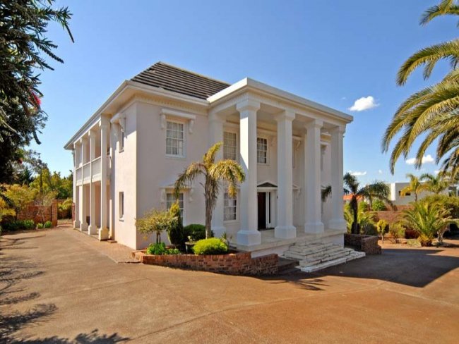
BEFORE: This 1970s Georgian-style mansion renovation in Wembley Downs (I featured it here) had light pink walls that desperately needed a repaint.
AFTER: It now looks much nicer with grey walls, which draw attention to the detailing.
This weatherboard cottage is given a modern touch with a lick of beautiful light olive-green. Source unknown.
CLASSIC: A rich taupe looks gorgeous on this Shenton Park cottage. Full home tour here. Photo by Red Images Fine Photography.
ABOVE: White walls to this 1900s Hamilton Hill cottage. Photo by Red Images Fine Photography.
GOING DUCK EGG BLUE
Recently Mr Nerd, Little Nerd and I visited family who live in seaside country NSW by Berry. Oh my goodness, the houses we saw in country and coastal NSW were just beautiful - and one of the things we noticed – and really liked – about them was the prevalence of exteriors painted the most beautiful gentle blues, grey-greens and duck egg blues - many more than you see here in WA.
Bronwyn is also a fan. “I love those duck egg blues - they are great in any room on the south side of the house,” she says. “They are very relaxing, soothing colours especially for bedrooms and they look wonderful with crisp white woodwork and ceilings. They look great in the older Federation-style houses as they are modern but work in an older house.” Calming greens can also be a great choice for character interiors.
TRIMS AND SKIRTINGS
“I always use white or grey, grey for exterior trimmings, white for inside,” says Bronwyn. “If you use colours on trims then the eye goes directly to the trim not to the room or the main exterior. It is more soothing to the eye to use white or grey.”
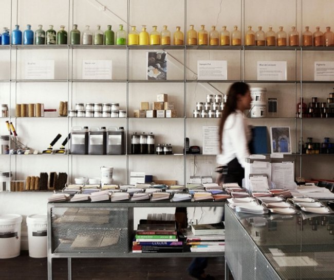
A BIT ABOUT OUR GUEST NERD – BRONWYN RIEDEL OF BAUWERK
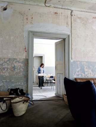
From small beginnings making all-natural paint right here in Fremantle, Bauwerk Creative Director Bronwyn Riedel now runs a hugely successful company that sells paint worldwide. After working as a textile designer and decorative artist, Bronwyn started Bauwerk in 2000 with her husband Andreas, who brought his own experience working in construction to the company. From their small beginnings in Fremantle, (where Bronwyn has lived for 25 years) they have since spread to the Middle East and Europe. She now travels extensively between Bauwerk bases, but still loves to be in the Fremantle store. “My eldest son Levi now manages that store and my stepdaughter is currently opening a store in Munich,” she says. ABOVE LEFT: Bronwyn with husband Andreas. ABOVE RIGHT: Their German castle and 'love project'. The neglected structure had not been a home for more than 70 years when Bronwyn and her family bought it. Bronwyn was sitting in her office in Australia on a Saturday morning, daydreaming about living in Europe when she spotted the property online and knew they had to have it. "It was love at first sight," she says. She is definitely a House Nerd!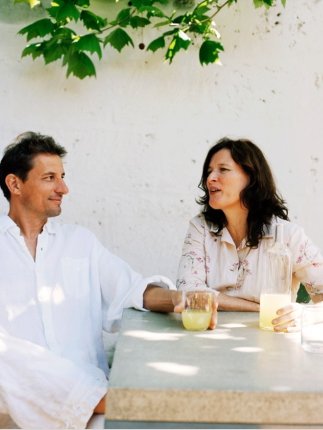
Bronwyn credits her upbringing in country Victoria as giving her a love for nature. “I have always loved nature and draw lots of inspiration from it,” she says. “We love to have our family involved - it makes it all worthwhile for us. I love every part of Bauwerk – all the opportunities it gives me, working with colour and I love working in collaboration with others.”
Everyone at Bauwerk is also hugely passionate about their incredible paints – and for good reason. “Our paint is completely different to others,” says Bronwyn. “Firstly we make it differently to others who make lime paints and then lime paints are different to other conventional paints, which are made from petrochemicals. Even water-based paints are full of toxic chemicals. The manufacture of those paints are very damaging to humans and the health of the environment. Our paints work with the environment and are made with natural materials and coloured with natural materials which make them, in our minds, more beautiful.” ABOVE: Bronwyn and Andreas' German castle, which they are restoring one step at a time. In the garden is Europe's largest plane tree. Photo by Bronwyn Riedel.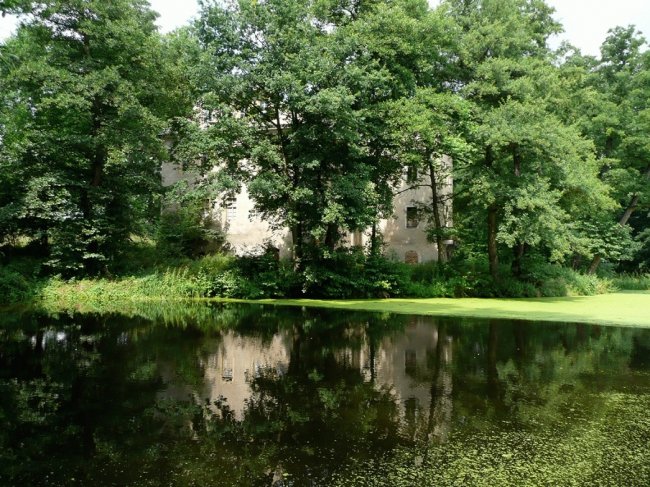
Bronwyn says one of her favourite things to do every year is to spend time at their house in Germany, where the family spends time together and works on ideas for the company. “Seven years ago we bought an old unloved schloss,” she says. (Schloss is German for castle or manor house). "We come here every European summer to spend time creating, brainstorming and enjoying time with friends and family.” You can see all the beautiful colours in Bauwerk’s range by visiting their website here.
WIN!
You can WIN a Bauwerk prize pack that includes 4L of beautiful lime paint valued at $88, a natural fibre brush valued at $22 and a Bauwerk email colour consultation to get professional advice on finding just the right colour for you.
To enter, just leave a comment your full name and just tell us what colours for the home you are loving at the moment - or which ones you've used. (I once painted the study in my 1970s home a sort of lipstick pink, thinking it would fill me with energy, then almost immediately regretted it – it’s now a beautiful grey-white).
You can get additional entries into the competition by following Bauwerk on Instagram @bauwerkcolour, Facebook, Pinterest or Twitter @bronwynriedel. Competition open to Australian residents only. Competition closes June 14th, 2016. Good luck! Maya x


