
It might be the norm in cities like New York and Paris, but I think here in Perth we are yet to fully embrace and think of clever design solutions for small-scale apartment living. That’s why I was so blown away with the amazing renovation of this tiny bedsit in East Perth – one of the smallest apartments I’ve come across!
Owner and architect Anthony Hines bought this 1960s apartment as a home, a renovation project and for a challenge, to see how he could redesign a small space. It’s compact - at just 36sqm in size, Anthony’s entire home is about the same size as my dining room and home office combined! When I thought about fitting a bedroom, bathroom, kitchen, living area, dining and laundry facilities in that space, my mind boggled. But Anthony has made it work.
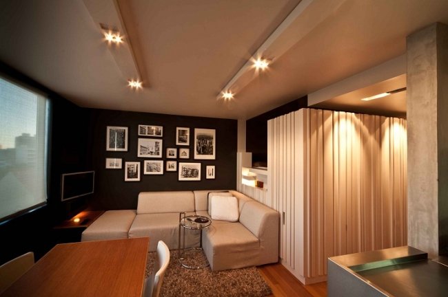
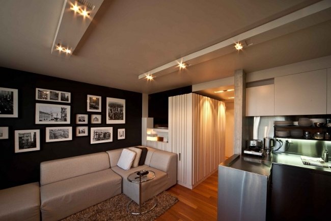
CHARCOAL WALLS: Not many people would have been bold enough to choose such a dark wall colour for such a small space, but the deep colour actually gives the walls the illusion of receding, making the space seem larger – and more sophisticated. “The apartment was actually going to be light-coloured,” says Anthony, who originally painted the whole place white before deciding to go dark. “The dark colour scheme blurs the walls.”
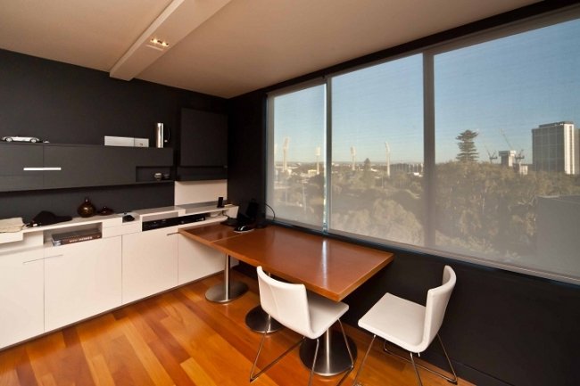
ABOVE: The dining tables perform double duty as a home office space, and for entertaining are pulled out into the centre of the living room floor.
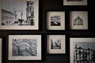
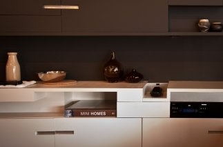
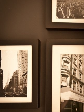
ABOVE: Anthony and his Dad Les built all the cabinetry themselves. I love the picture wall. Central is an old photograph of St Georges Terrace.
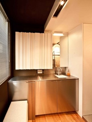
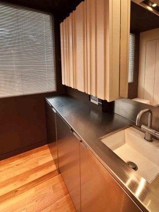
BATHROOM AND LAUNDRY: I love how integrated everything is here. The bathroom cabinetry neatly hides a washing machine and dryer.
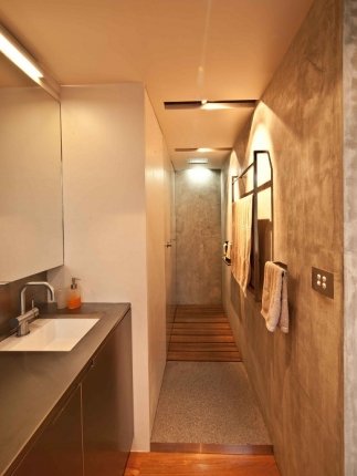

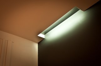
ABOVE LEFT: The shower with separate toilet to the left. Vanity cabinetry conceals a washer and dryer and the large wardrobe adjoining this area has plenty of storage. RIGHT, LIGHTING SOLUTIONS: When you have a concrete pad to the ceiling and an apartment above it can be really hard to put in new wiring. The solution was to create slimline bulkheads that conceal the modern, new adjustable downlights.
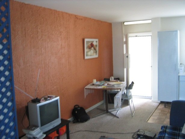
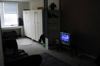
ABOVE: Anthony describes the old apartment as having been depressing. The former layout had people walking straight into the living area with scary textured orange feature wall.
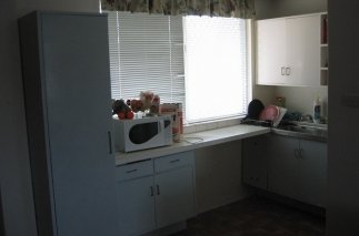
BEFORE SHOTS: The old kitchen was positioned at the front of the apartment and had a lino floor and dated cabinetry. An old carpet revealed parquetry flooring underneath – which sounds like a win, but it was old jarrah that was in such poor condition Anthony decided to replace it. “It made the apartment look very dark and pieces were being pulled up and falling apart,” he says. Now the apartment has stylish messmate timber floors. P.S. I have no idea what Girlband (on the TV screen) is.
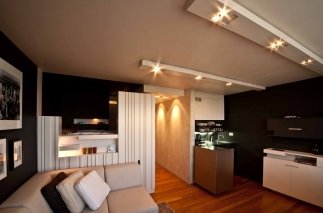
Anthony aimed to give the apartment defined zones that did not waste a single bit of space. “The whole idea was to get the apartment feeling as close to a house as possible,” he says. “Thinking along the lines of, ‘What has a house got?’ but scaled down.”
As you can see from the before photos, the apartment has gone from shabby uni student-esque digs to a stylish, modern pad with a floor plan that makes the most of every bit of space. It’s not Anthony’s first time living in a small space. Prior to this apartment he lived in a 44sqm one that had no doors and no privacy that he always wanted to change around. “When I saw this apartment, I had a plan in mind already,” he says.
But first he had to spend time inhabiting it. “I lived in it for three months first and it was completely depressing,” says Anthony, who likens the experience to that feeling you get when you feel cooped up in a bad hotel room. Now it’s a completely different story. “I can actually spend the whole day here relaxing on the weekend and I don’t get that feeling like it’s crowding in on me.”
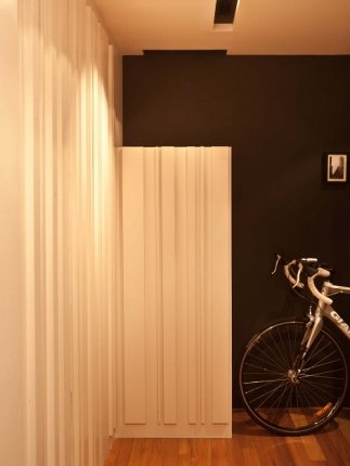
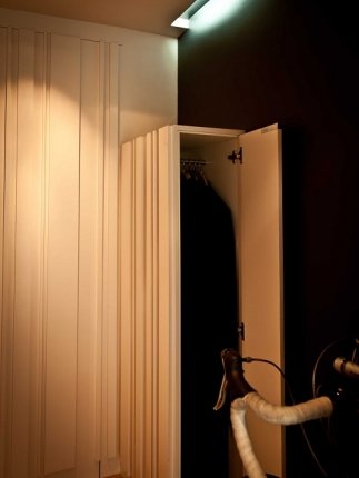
ABOVE: Anthony hates how in small apartments a bicycle often ends up taking up space in the bedroom or lounge. His new entry designed to take his bike, with a spot for a helmet in a cupboard by the bed. The entrance also has a coat cupboard.
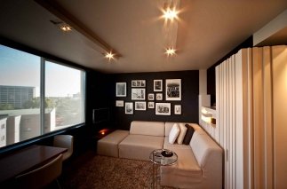
ABOVE: In the living room a Freedom couch sits next to a 1930s modernist Eileen Gray adjustable table.
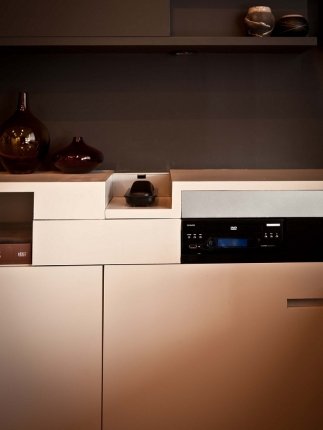

ABOVE: Custom-cabinetry for the DVD player. RIGHT: Architect and owner Anthony Hines.
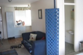
The blue lattice went as Anthony completely gutted the space, moving the living area to the back of the apartment to make the most of the views. Originally one walked into the old apartment straight into the kitchen and sitting area, with freaky textured orange feature wall, baby blue kitchen cupboard and old carpet.
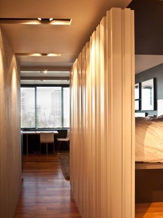
Now there is a proper entrance area that enhances the sense of privacy in the apartment and also offers a perfect spot for Anthony’s bike. “The entry door location allowed for the creation of a transition zone offering visual and acoustic privacy and achieves a breezeway which passively cools the unit throughout most of the summer,” he says.
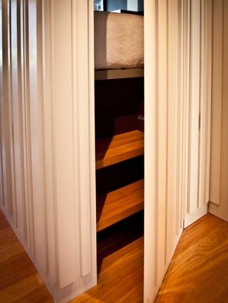
THE RAISED BED: A door opens up to reveal the timber steps to the raised bed, which reminds me of how much I loved bunk beds when I was a kid. It has that cozy, secret cubbyhouse feel that makes me want to shine a torch on my face and tell ghost stories in a scary whisper. (“Axe murderers lick hands too...”)
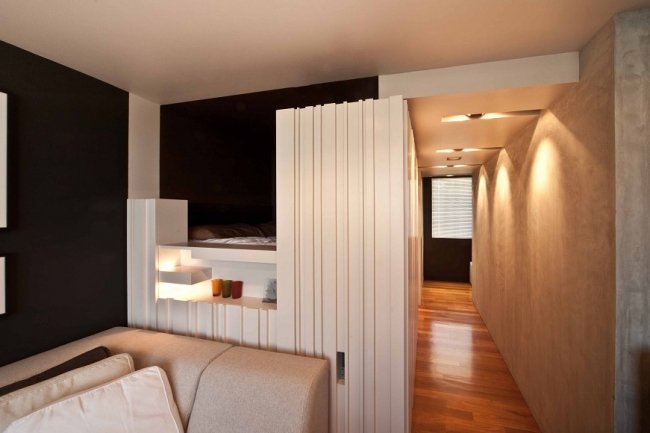
The bed design makes great use of the space. “I raised the bed up off the floor so you can lie in bed and still see the views across the living area,” says Anthony. Underneath is a large storage area and there is storage built into the white-painted timber panels around it as well – including spots for CDs! There is a hidden screen between the bed and the living area that can be pulled up if privacy if desired.
The apartment is in a huge complex in East Perth and has sweeping city views across to the WACA and the Swan River beyond. The building is made up of many small one-bedroom and bedsit apartments and was designed by renowned architectural firm Krantz & Sheldon. “They brought a European concept here that, before then, was unlike anything else in Perth,” says David. “Back then there were your two-storey Mt Lawley units but not really your high-rise apartment blocks.” Anthony says Krantz & Sheldon had revolutionary plans for their time.
“They tried to make small plans work and their buildings quite economical,” he says.
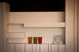
One of the things I loved most about the redesigned apartment was how much storage there was. Anthony designed and built the storage himself and there is truly a designated space for everything, from the DVD player to CDs to the air con remote to spare chairs for entertaining (underneath the raised bed, designed to allow for storage space underneath and to also make the most of the views beyond the living areas).
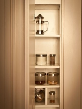
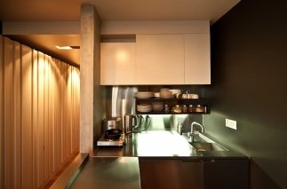
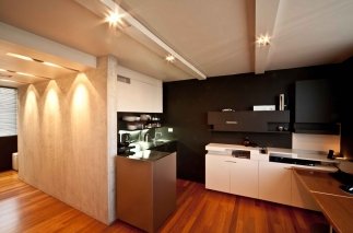
ABOVE: There is hidden storage all through the apartment. RIGHT: The new compact kitchen with concealed fridge. The central wall is of dado plaster - mmm! I have a bit of a finish fetish for dado plaster. So beautiful. If I was a cat I would want to rub myself over it.
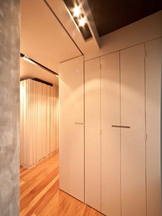
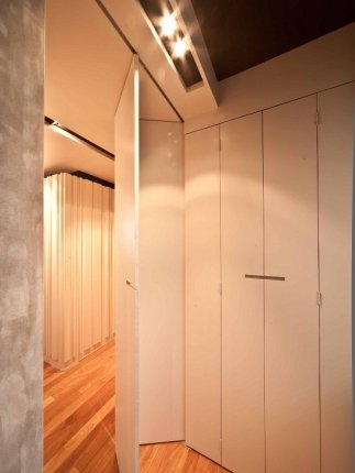
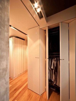
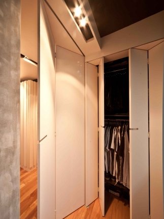
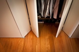
BI-FOLD BRILLIANCE: To compensate for the lack of a bedroom, Anthony created a dressing area with a large built-in robe with adjoining bi-fold door which folds out and away from the cupboard to zone off the bathroom area for privacy – very smart!
It’s small but very liveable – proven by the fact that it has just been bought from Anthony and will next be lived in by a couple. It’s decent for entertaining, too - Anthony pulls the dining table by the window out into the centre of the living and kitchen when people come over. “He’s had some pretty good dinner parties here,” says David of his friend. Despite its small footprint, I can see how the apartment would be nice for entertaining. It’s stylish, warm, comfortable and inviting – a little home that truly feels good.

HOME LOWDOWN

THE OWNER & ARCHITECT
Architect Anthony Hines, 0418 904 755
HIS HOME
A small 36sqm architect-designed, fully renovated 1960s bedsit apartment
LOCATION
East Perth, Western Australia
PURCHASED
2009
FEATURES
Architect-designed floor-plan, open-plan kitchen, living and dining area, raised bed, custom-made cabinetry, dado plaster feature wall, secret cupboards and storage nooks, recessed night lighting, combined dressing room, bathroom and laundry, coat cupboard, bicycle space
THE BUILDERS
Anthony and his father Les did much of the fitout, concrete wall by Plasterwise Solid Plastering Enterprises, stainless steel cabinetry from Caterlink
PHOTOGRAPHY
The very talented architect David McLoughlin of Nutkin Photography. Check out more of his work on his website here or follow on Facebook here


